
Or have corporate web sites become more obtuse?
We’ve all heard the message on hold. “Most of your questions can be answered by going to our website www.blahdeblahblahblah.com”
Some of us fume, (I’m one of the fumers) I hear that message and think, “If I had found what I was looking for on your daffy website, I wouldn’t have dug up your freakin phone number from your website to call you.”

I’m reminded of the passage in Hitchhiker’s guide to the Galaxy between Arthur Dent and the Foreman of the construction crew ready to destroy Arthur’s house.
“But the plans were on display…”
“On display? I eventually had to go down to the cellar to find them.”
“That’s the display department.”
“With a flashlight.”
“Ah, well, the lights had probably gone.”
“So had the stairs.”
“But look, you found the notice, didn’t you?”
“Yes,” said Arthur, “yes I did. It was on display in the bottom of a locked filing cabinet stuck in a disused lavatory with a sign on the door saying ‘Beware of the Leopard.”
― Douglas Adams, The Hitchhiker’s Guide to the Galaxy
Indeed websites appear to bury the lead more frequently now than in the past.
Design and Stylistic Rant
I ’ve decided that the next website I build I’m going to put all the contact information, frequently asked questions, phone numbers, mailing addresses, and any other useful information behind an image of a disused lavatory door with a sign that says “Beware of the Leopard” (That’s my web design idea, call it copyrighted). Optionally, I may add another layer of annoyance by forcing the intrepid web user to open a filing cabinet then simulate flickering of light to make reading the information (displayed as either yellow on grey or red on grey characters) stored in the filing cabinet, a much more challenging thing to do before your first cup of coffee.
With all these designers with their media/ design/ art school diplomas in web design, you’d think that at some point some professor would have discussed that a significant portion of the population exhibit some level of red-green or blue-yellow colorblindness and a larger portion of the population are shade blind as well.
Which means that putting a 10 point HelveticaNarrow font in white on a light grey page, is going to look to a lot of folks like a blank page.
I’m not shade or color blind, and stuff like that is annoying as hell to me. All it takes is an allergy day, a cold, or dry eyes and now my lovelies, your web page is useless to pretty much everyone.
I shouldn’t have to open your page in an HTML editor to be able to see what’s on it.
Just Sayin…
Anyhow.
My finger is hovering over a schedule time button on the Apple webpage.
I’ve spent 10 minutes thrashing through pages intended to answer every question and provide every service EXCEPT something that must take place in the physical world.
Why not make it simple? How about putting a button Front and Center that says SCHEDULE a visit with an Apple Genius? How about putting that right at the bottom of the opening page?
<sigh> It’s the age of obfuscation.
I’m finally on the page, I think, that will allow me to complete the task that I thought would be simple and only take a minute.
Hovering over the button, I ask myself why is it that I can ONLY schedule on a single day a week out? Why can’t I schedule an appointment on any of the other days that week? Why can’t I schedule an appointment 2 weeks out?
Why is Apple dictating essentially that I’ll have to make a special trip to their store and not be able to combine that trip with other things I might already have on my agenda?
My finger is still hovering. the first appointment is 2:15 in the afternoon, I’d really like a morning appointment, I don’t like being in Apple stores in the afternoon or evening.

Then it hits me;
I DON’T LIKE BEING IN APPLE STORES AT ALL!
But the morning is always preferable to afternoon.
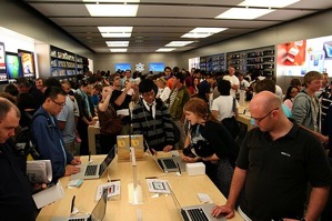
I slowly come to realize that while I like Apple products, I can’t stand the noise, crowding, confusion, and general disarray that every single Apple store has become. I’ve actually been to shooting ranges that were quieter than most Apple Stores.
It’s like being in an ‘80s disco bar.
Everyone is yelling to be heard, there’s continuous BOOMING driving base coming from the PA system and at least half a dozen different sound sources all around the room. People are shoving to get to whatever bright and shiny, they want to play with, and they’re rude about it.

At least in a bar, I’d have a drink that would be acting as an anesthetic.
Alas, Apple stores, for all their other bar-like similarities are lacking the one critical component that would allow me to justify shouting over music which is indistinguishable from being on the flight line of a aircraft carrier during a fighter scramble.
Whiskey!
The only bar I’ve ever enjoyed with noise as loud as the Apple store, was a place where you could get a drink and a BLOW-JOB at the same time.

The volume of the music was to hide the grunts, shouts and “Rebel Yells” of various guys blowing their loads down willing throats. In other words, the pain in my ears was offset by alcohol and nasty pleasure.
I’m spending premium dollars in an Apple Store. I don’t need Vivaldi but I would like to conduct business at some decibel level below 200. I’d like to literally be able to hear myself think.
The 2:15 appointment has vanished. 2:45 is available.
My finger still hovers over the button.
Nah… I’ll wait.
